I did a Facebook Live this Tuesday night, focusing on different places to get color inspiration. If you’ve been a Stampin’ Up! customer for a while, you know that one place to get color inspiration, or more specifically, to figure out what colors to use when choosing a specific designer paper, is the back of the designer paper package. Stampin’ Up! lists the primary colors, making it easy to create cards. Sometimes it’s a bit surprising though.
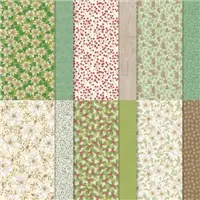
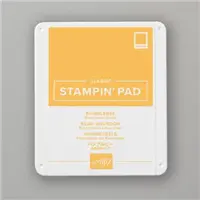
For instance, did you know that the first color listed on the Poinsettia Place designer series paper package is Bumblebee?! I’m sure colors are listed in alphabetical order now that I think about it, but still, who would have thought Bumblebee?!
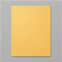
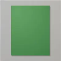
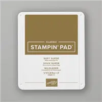
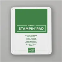
I decided to create a card very quickly, using the Bumblebee, Garden Green and Soft Suede colors listed. Here’s my card:
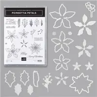
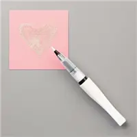
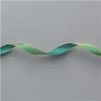
The card base is Garden Green, then I did a Bumblebee mat, and finally, a Poinsettia Place designer paper layer. I stamped the largest and medium single poinsettia flower in Soft Suede, then colored the petals from the inside out with Wink of Stella. This made the petals almost resemble the designer paper layer exactly. I stamped the pine branches in Garden Green, and stamped the poinsettia center and the berry sprig in Bumblebee. The ribbon is the lovely Garden Green/Pretty Peacock reversible ribbon.
(*Just a note — I never realized that this ribbon is actually Old Olive/Pretty Peacock reversible ribbon. Who knew?! Well, luckily Old Olive is one of the colors listed in the designer paper package too!)
Here’s a closeup view of the card:
So, don’t be afraid to experiment with colors, even if they don’t fit the “classic color scheme”! What do you think of the card?! Please leave me a comment!


